Dynamic Views 
Dynamic Views are used in the SDK to define and create SwiftUI screens like the Start (Dashboard) and Profile tab. The structure of these dynamic created views are defines via a JSON file.
The Start and Profile tab of the iOS Sample App:
| Start (Dashboard) | Profile |
|---|---|
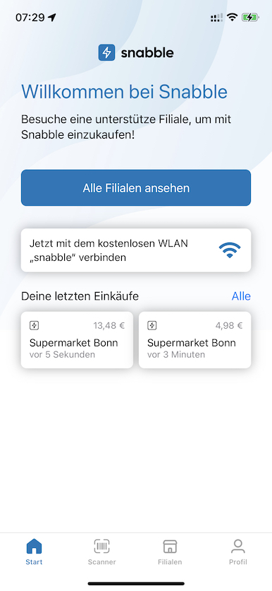 | 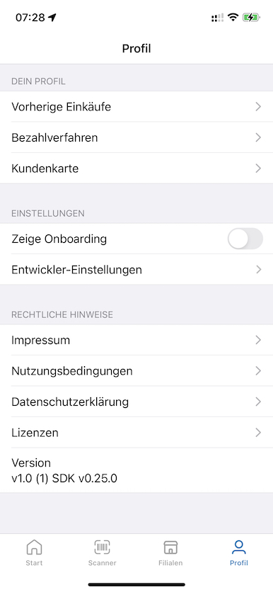 |
JSON Configuration
The description of a Dynamic View is done via a JSON file. The file must contains two elements configuration and widgets.
{
    "configuration": {
        ...
    },
    "widgets": [
       ...
    ]
}
Configuration
The configuration element use the image to display as a background for a Dynamic View. The style element can be either "scroll" or "list".
"scrool"all widgets are displayed in a vertical scroll view from top to bottom."list"all widgets are displayed in a list view which can be group using a Section Widget
| Parameter | Type | Required | Example |
|---|---|---|---|
image | String? | no | "Dashboard/teaser" |
style | String? | no | "scroll" or "list" |
padding | Margins? | no | [ 30, 16 ], { "bottom": 4 } |
Widgets
The widgets are defined as an array of "widgets" in the JSON Configuration file. Currently the following widget types are supported:
User Widgets
The User Widgets are used to represent App specific UI elements and actions the App can respond to. The hosting app can return requested UI elements to display. Each widget send an action to the hosting App when the user taps on it.
SDK Action Widgets
The SDK Action Widgets are special widgets build into the SDK. These widgets are self contained and implements a predefined action to trigger, if the use taps on it.
- Location Permissions
- Start Shopping
- Show All Stores
- Connect Wifi
- Customer Card
- Last Purchases
- Developer Mode
- Version
Widget Reference
Each Widget has three fixed parameters.
| Parameter | Type | Required | Example |
|---|---|---|---|
id | String | yes | "1" |
type | String | yes | "text" |
padding | Margins? | no | [ 30, 16 ], { "bottom": 4 } |
The id parameter is a String which must be unique for any siblings in a group of widget definitions.
The type parameter must be one of the Widget types defined below.
The padding parameter describes the margin around the widget.
User Widgets
Text
Widget to display text.
| Parameter | Type | Example |
|---|---|---|
id | String | "1" |
type | String | "text" |
text | String | "Sample.Dashboard.text" |
textColor | String? | "label" (semantic color) |
textStyle | String? | "title" (semantic textStyle) |
showDisclosure | Bool? | true |
Image
Widget to display an image.
| Parameter | Type | Example |
|---|---|---|
id | String | "1" |
type | String | "image" |
| `image | String | "Sample.Dashboard.image" |
Button
Widget to display a button.
| Parameter | Type | Example |
|---|---|---|
id | String | "1" |
type | String | "button" |
text | String | "Sample.Dashboard.text" |
forgroundColor | String? | "label" (semantic color) |
backgroundColor | String? | "systemBackground" (semantic textStyle) |
Information
Widget to display an optional image on the left side of an informational text.
| Parameter | Type | Example |
|---|---|---|
id | String | "1" |
type | String | "information" |
text | String | "Sample.Dashboard.Information.text" |
imageSource | String? | "Sample.Dashboard.Information.image" |
hideable | Boolean | true |
Toggle
Widget to display an text on the left side of an toggle button.
| Parameter | Type | Example |
|---|---|---|
id | String | "1" |
type | String | "toggle" |
text | String | "Profile.showOnboarding" |
key | String | "io.snabble.sample.showOnboarding" |
Section
The Section Widget help to group widgets in section.
| Parameter | Type | Example |
|---|---|---|
id | String | "1" |
type | String | "section" |
header | String | "Profile.header" |
items | [Widget] | Contains an array of child widgets |
MultiValue
Widget to store a value for a key in the UserDefaults system.
| Parameter | Type | Example |
|---|---|---|
id | String | "io.snabble.environment" |
type | String | "multiValue" |
text | String | "Profile.environment" |
"values" | [(id,text)] | An array of tuples where the id is assigned to the multiValue id. |
The following JSON MultiValue definition:
{
    "type": "multiValue",
    "id": "io.snabble.environment",
    "text": "Profile.environment",
    "values" = [
        {
            "id": "io.snabble.environment.testing",
            "text": "Profile.Environment.testing"
        },
        {
            "id": "io.snabble.environment.staging",
            "text": "Profile.Environment.staging"
        },
        {
            "id": "io.snabble.environment.production",
            "text": "Profile.Environment.production"
        }
    ]
}
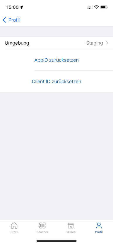
Is rendered as a Dynamic View widget to switch the server environment:
| Profile | Environment Selection |
|---|---|
 |  |
In the example above the UserDefaults would contain a key/value pair like:
"io.snabble.environment" = "io.snabble.environment.staging"
SDK Action Widgets
the SDK Action Widgets are special widgets build into the SDK. These widget are self contained and implements a predefined action to trigger if the user taps on it.
Location Permission
Widget to ask the user to grant for location permissions. After the user has approved access the widget will disapear.
| Parameter | Type | Example |
|---|---|---|
id | String | "1" |
type | String | "snabble.locationPermission" |
Start Shopping
If the user has entered a shop, a tap on the Start Shopping button will start the scanner.
| Parameter | Type | Example |
|---|---|---|
id | String | "1" |
type | String | "snabble.startShopping" |
All Stores
The widget navigates to the Shop Finder view where all shops are listed. The user can select a specific item of the list and the Shop Detail view with a map, shop description and opening hours is displayed.
| Parameter | Type | Example |
|---|---|---|
id | String | "1" |
type | String | "snabble.allStores" |
Connect Wifi
Widget to ask the user to grant access to a local Wifi network.
| Parameter | Type | Example |
|---|---|---|
id | String | "1" |
type | String | "snabble.connectWifi" |
Customer Card
Widget to show a customer card.
| Parameter | Type | Example |
|---|---|---|
id | String | "1" |
type | String | "snabble.customerCard" |
Last Purchases
Widget to display one or two of the recent purchases. If the user taps on a recipe preview item, the detail view for that receipt is displayed.
| Parameter | Type | Example |
|---|---|---|
id | String | "1" |
type | String | "snabble.lastPurchases" |
Developer Mode
Widget to display the developer options.
| Parameter | Type | Example |
|---|---|---|
id | String | "io.snabble.developerMode" |
type | String | "developerMode" |
items | [Widget] | Contains an array of child widgets |
The SampleApp defines the following JSON in the Profile.json file:
{
    "type": "developerMode",
    "id": "io.snabble.developerMode",
    "items": [
        {
            "type": "multiValue",
            "id": "io.snabble.environment",
            "text": "Profile.environment",
            "values": [
                {
                    "id": "io.snabble.environment.testing",
                    "text": "Profile.Environment.testing"
                },
                {
                    "id": "io.snabble.environment.staging",
                    "text": "Profile.Environment.staging"
                },
                {
                    "id": "io.snabble.environment.production",
                    "text": "Profile.Environment.production"
                }
            ]
        },
        {
            "type": "button",
            "id": "Profile.resetAppID",
            "text": "Profile.resetAppID",
            "key": "io.snabble.resetAppID"
        },
        {
            "type": "button",
            "id": "Profile.resetClientID",
            "text": "Profile.resetClientID",
            "key": "io.snabble.resetClientID"
        }
    ]
}
The code above is rendered as a Dynamic View:
| DeveloperMode widget |
|---|
 |
Version
Widget to display the current version and to switch on developer mode. After tapping 5 times on the version text a dialog appears to enable developer mode.
The SDK ask the hosting app for a base64 decoded string with the following call: var password = Asset.localizedString(forKey: "SnabbelDeveloperPassword"). The hosting app can provide a app specific password to enable developer mode. If the hosting app return nil the default password Snabble is used to enable developer mode.
| Parameter | Type | Example |
|---|---|---|
id | String | "1" |
type | String | "version" |
See also: Developer Mode
Example
JSON Example of SnabbleSampleApp file Dashboard.json to describe the Start tap (Dashboard) as a Dynamic View.
{
  "configuration": {
    "image": "Dashboard/teaser",
    "style": "scroll",
    "padding": [ 30, 16 ]
  },
  "widgets": [
      {
          "type": "image",
          "id": "1",
          "image": "Dashboard/image",
          "padding": {
              "bottom": 16
          }
      },
      {
          "type": "text",
          "id": "2",
          "text": "Dashboard.title",
          "textColor": "accent",
          "textStyle": "title",
          "padding": {
              "bottom": 4
          }
      },
      {
          "type": "text",
          "id": "3",
          "text": "Dashboard.text",
          "padding": {
              "bottom": 32
          }
      },
      {
          "type": "snabble.locationPermission",
          "id": "4",
      },
      {
          "type": "snabble.startShopping",
          "id": "5",
      },
      {
          "type": "snabble.allStores",
          "id": "6",
          "padding": {
              "bottom": 24
          }
      },
      {
          "type": "snabble.connectWifi",
          "id": "7",
          "padding": {
              "bottom": 16
          }
      },
      {
          "type": "snabble.customerCard",
          "id": "8",
          "projectId": "snabble-sdk-demo-beem8n",
          "padding": {
              "bottom": 32
          }
      },
      {
          "type": "snabble.lastPurchases",
          "id": "11",
          "projectId": "snabble-sdk-demo-beem8n"
      }
  ]
}
Interactions
Interactions are passed to the app via the widget ID and an optional element ID. The widget id is always the id from the configuration. For example, an element id is Snabble.Dashboard.Purchases.more, this string identifies the "More" button on the Previous Purchase widget as an action. For example, it can also be just a string like 12345, which in the case of the widget ID from Purchases is the id of a receipt.